Logos explained
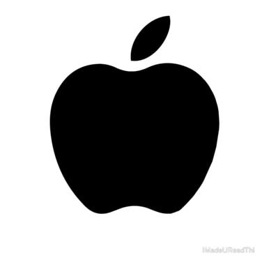
The Apple logo may seem simple, but its creation was backed by scientific reasoning and trial and error. – Photo by Apple
There are a lot of logos out there, but many don’t know the reasoning behind the logos that aren’t obvious. Do you know why the Apple logo has a bite in it? Do you know the reasons that the colors were picked for the Ford logo? If not, keep reading below to find out.
- Apple
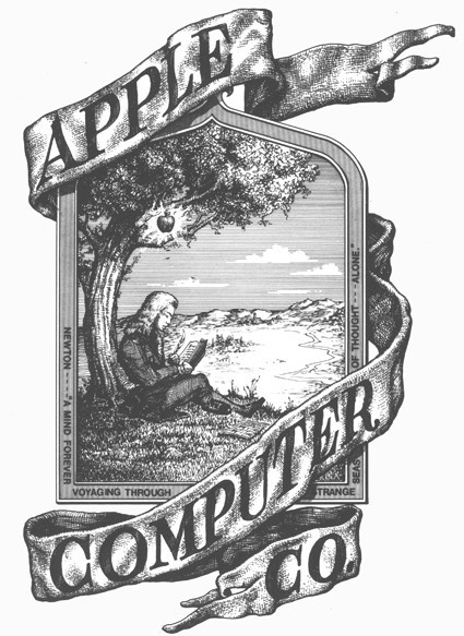
Apple’s logo of an apple has many people wondering why there is a bite in the fruit. This all started when designer Rob Janoff was hired to remake Apple’s logo, which at the time was a complicated drawing of Isaac Newton under an apple tree.
Janoff decided to go for an actual design instead of just writing their name on their products. This is what the other major computer companies at the time were doing—like Hewlett Packard and IBM. People mistook the apple silhouette for a cherry, so Janoff decided to put a bite in it so that people had an idea of the size of the fruit.
- Nike
The Nike swoosh represents motion and speed. The word “swoosh” itself helps you picture someone running or something happening quickly. Bill Bowerman and Phil Knight got together at the University of Oregon to make a new track spike. In the 1960s, Blue Ribbon Sports was founded by the pair to distribute shoes.
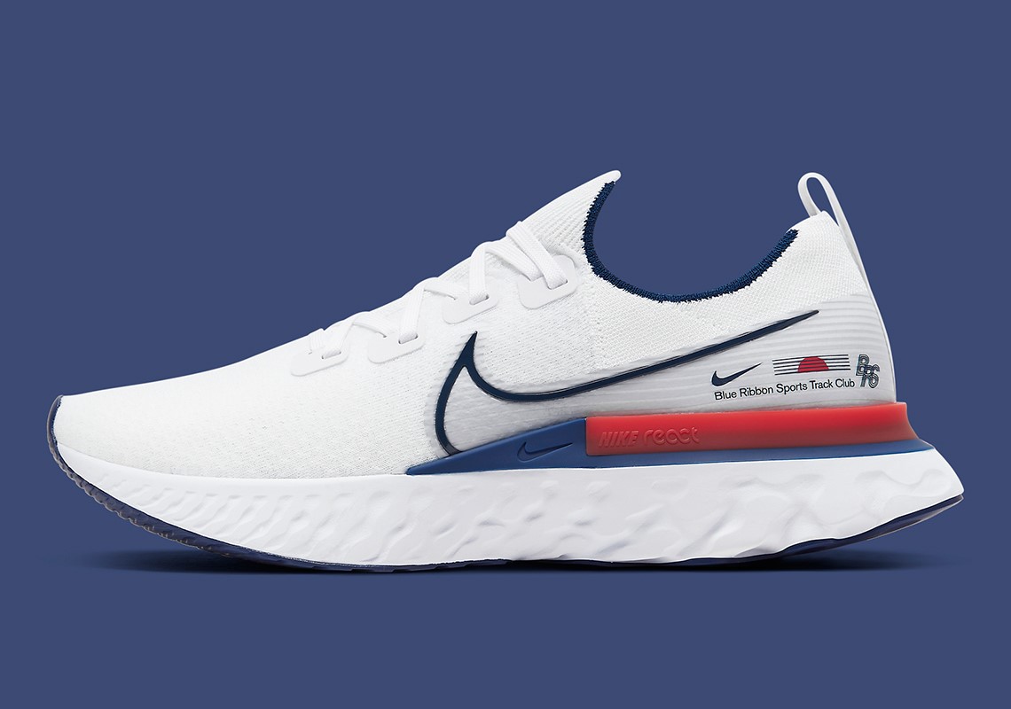
Nike, the Greek goddess of victory, was adopted as their name in 1971. While teaching, Knight met Carolyn Davidson and hired her to make infographics for presentations. This eventually led to making his business logo, and he asked for something that represented movement. She worked on the swoosh logo for 17 hours and was paid by Knight only 2 dollars per hour. As the company grew, the swoosh logo became iconic and known by many.

- Ford
The logo for Henry Ford’s iconic company is pretty self-explanatory because it says the Ford name. However, the colors were picked for specific reasons. The blue symbolizes strength of the company and its ability to withstand challenges. It also represents excellence and grace, and their quality products. The white, on the other hand, depicts nobility, and the honesty of the brand. It also stands for elegance and purity.
The Ford logo is among the most recognizable logos. Recently, when the 2021 Ford Explorer Timberline came out, Ford put a new logo on it. The Timberline is a hybrid electric vehicle. The old logo is also on the car, but the new logo is featured under it. Ford may start using this logo for all of their cars.

There are many iconic logos with interesting backstories out there. As companies grow and change, their logos may evolve into something better. The companies that started out small have grown into companies whose logos are easily recognized.