iPhone app icons, explained
Some of Apple’s icon choices are surprisingly meaningful. – Photo by Tom’s Guide
May 31, 2022
Five of Apple’s included apps have icons that actually have a larger meaning or purpose behind them than just a simple design that consumers think of.
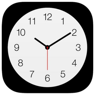
- Clock
To start off, this app icon’s “secret” isn’t much of a secret at all. Many people have noticed that the clock actually moves as a functioning clock, with its hands moving along with the realistic time. The clock app’s logo is an analog clock that really works!
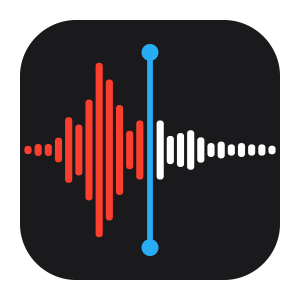
- Voice Memos
The recording app, Voice Memos, shows what the app might look like when you speak into it, showing how loudly you are talking by arranging parallel lines in red. However, this isn’t just any word. When you say “Apple” into the app, you’ll see that it makes the exact pattern as is on the icon.
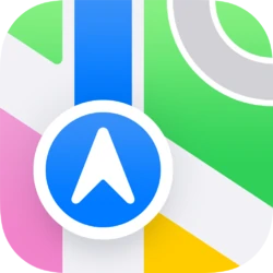
- Apple Maps
The Apple Maps logo shows an enlarged piece of a map which you might see while using the app. Just like the Voice Memos app, this isn’t just a random map design. The fraction of a circle you’ll see in the top right part of the icon actually represents Apple Park, which is Apple’s headquarters with a circular road surrounding it.
- Glasses icon
Different iPhone apps may have a glasses icon within their app. These glasses actually represent Steve Jobs’ glasses, which look a little bit like Harry Potter’s glasses.

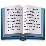
- Book Emoji
If you look at Apple’s book emoji, you may see small letters that are very difficult to read. However, if you zoom in on it, it says, “Here’s to the crazy ones. The misfits. The trouble makers. The round pegs in the square holes. The ones who see things differently. They are not fond of rules. And they have no respect for the status quo. You can quote them, disagree with them, glorify or vilify them. About the only thing you can’t do is”. It ends here due to lack of space for an emoji, but the sentence continues. It’s actually Apple’s “Think Different” marketing campaign.
Companies such as Apple hide secret meanings in many designs, and the meanings of simple things may be deeper than you might think.